Adaptive.js
UI Designer at Mobify
Adaptive.js is Mobify’s newest product that gives web development teams the ability to adapt desktop websites for mobile devices and enhance responsive website user experiences all on the client-side. This technology is currently being used to deliver some of the web’s most active mobile eCommerce sites such as Garmin, Threadless.com, Superdry, Tommy Bahama and more.
Process
- User Research and Interviews
- User Flow Diagrams
- Information Architecture
- Wireframing
- Prototyping
- User Testing and Feedback
- Mockups
- HTML & CSS Implementation
Understanding the User
Adaptive.js is a complete rewrite of Mobify’s core technology, ‘mobify.js’. Since this was a complete restructure based on years of development experience with the technology, both internally and externally, we decided the user interface deserved another look at whether or not it catered to our latest understanding of who are users were and how they used it.

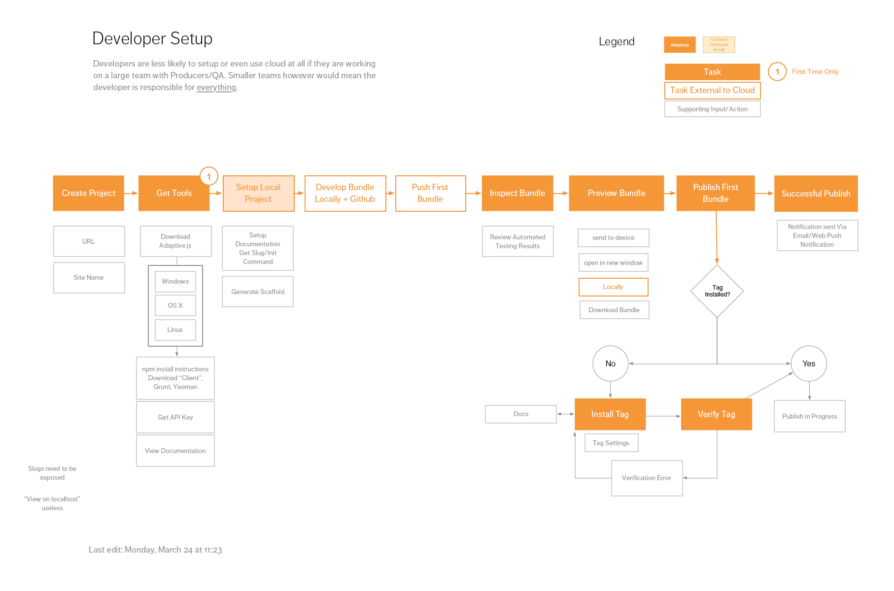
User flow for a user identifed as a ‘developer’
I spearheaded the user research activities which led to numerous meetings and discussions with both our internal customer delivery team and partnered development teams. We identified that our current interface only catered to a small percentage of our users which validated the need to reimagine the user interface for Adaptive.js.
Mapping Out The Application
Using the information gathered from our user research, I began mapping out the information architecture (IA) of our application in a way that clearly communicated the tasks and objects that a user would need to interface with in order to be successful with our software.

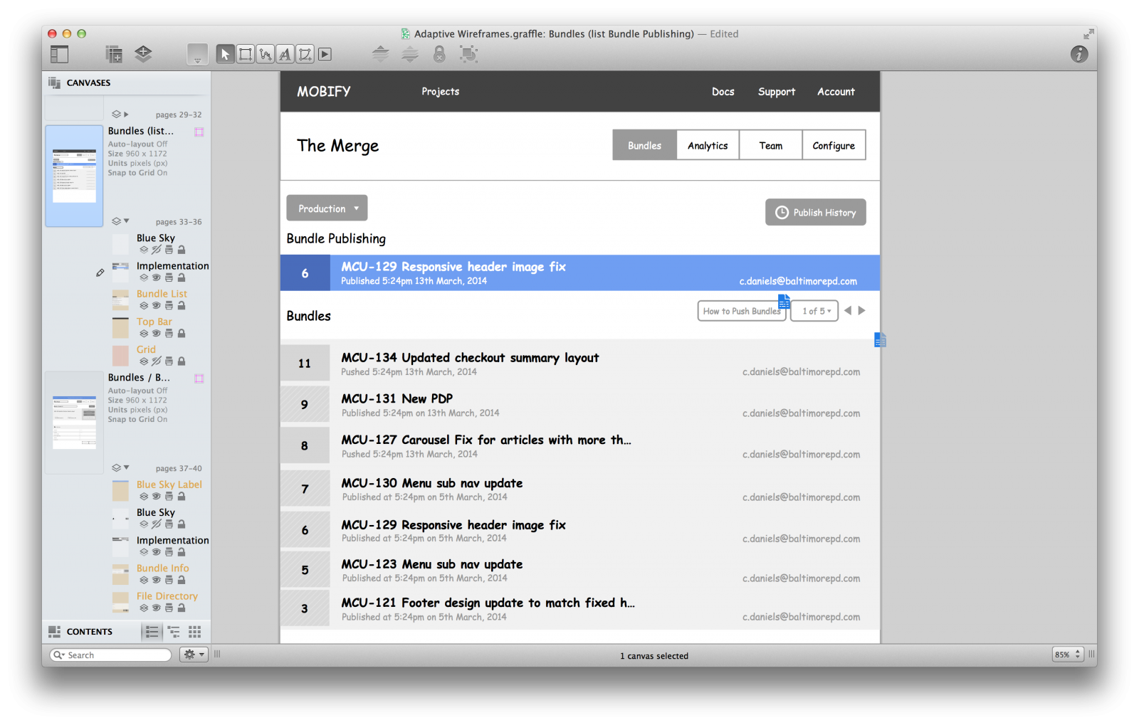
Building wireframes based on real content, user emails have been changed for obvious reasons
I pulled in some engineers to discuss and verify the IA which led to wireframing. For this project I created a ‘blue sky’ vision of where we wanted to take the application in Omnigraffle. I was able to quickly turn this into a prototype and start facilitating light user testing and validation. This allowed me to iterate quickly and produce a clear idea for the core components and layout how future features would modularly extend within the user interface without getting slowed down by details.
Crafting Pixels
During sprint planning we would identify what parts of the application we wanted to commit to developing using the detailed wireframe I drafted. We had a clear goal every sprint whether we were building out minimum viable features or iterating on existing features based on closed access feedback from real users.
Our maturing style guide meant that engineers were able to start implementing based on wireframes if myself or Dave, the other designer, had not gotten around to creating detailed mockups to follow. We were then able to iterate quickly and clean up their HTML and CSS structure if they were working from wireframes.

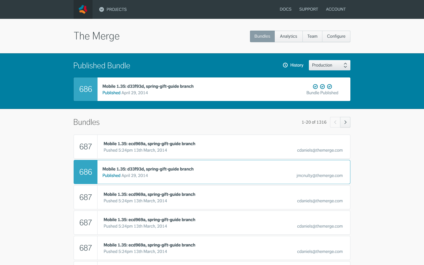
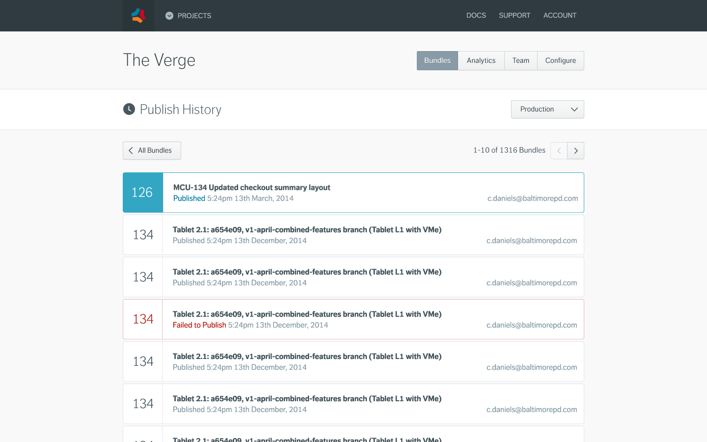
Because my detailed low-fidelity wireframes were designed with real content and data pulled from existing project I was able to confidently mockup the designs for different states of the user interface. Any iterations made with the browser or mockups would also be synced back up the design pipeline to ensure we were constantly iterating at all levels and made it quick to experiment within the appropriate fidelity and context.
All The Way To The Front End
Whilst working on the majority of this project, we only had two designers in the Product Team. As the designers on the team we responsible for developing and maintaining our own CSS framework.
Luckily I was in good company as the other designer was Dave Shea, well known creator of the CSS Zen Garden. We both contributed evenly in discussions and development of our object oriented CSS framework dubbed ‘Argon’. We’ve been actively implementing and developing the syntax over the last 12 months which we’ve been using to slowly refactor all of Mobify ‘Cloud’ user interface. This in particular has been an extremely insightful and rewarding experience.
Summary
This project was a great experience that allowed me to refine and document my design process. It was a very collaborative effort that involved many types of people including other designers, engineers, users and stakeholders.